SSP Brand Kit
Official logos, colors and guidelines for SSP Wallet and SSP Key. Use them in articles, integrations, exchange and provider listings, and videos.
SVG is the source for every logo. Use SVG wherever you can and PNG only where a vector won't work.
Logo
The full logo: the three-pillar symbol plus the SSP wordmark. Pick the file that matches your background.


PNG files are 2048 px wide with a transparent background.
Symbol
The three pillars on their own, for when the space is too small or too square for the full logo.



PNG files are 1024 px tall with a transparent background.
Icon
The symbol on a solid tile, for avatars, provider and wallet lists, app tiles and social profiles. Amber is the default. Dark or light work where amber clashes with your UI.


























SSP Key app icon
The SSP Key mobile app has its own icon. Use it only when you refer to the mobile app.

Colors
The amber ramp comes from the pillars of the symbol. Click any value to copy it.
SSP Amber
Primary brand color: buttons, highlights, accents
Amber Light
Center pillar of the symbol
Amber Deep
Left pillar of the symbol, hover states
Amber Action
Calls to action, gradient end on marketing
Graphite
Right pillar and wordmark on light backgrounds
Night
Dark backgrounds and surfaces
White
Right pillar and wordmark on dark backgrounds
Text and icons on SSP Amber are always black, never white.
Typography
Two free Google Fonts: Montserrat for headings, Inter for everything else.
Inter
Body and UI · Weights 400 · 500 · 600 · 700
Every transaction needs both your browser and your phone to sign it, so one stolen device can't move your funds.
Get it on Google FontsBoth are free under the SIL Open Font License. The SSP wordmark is custom lettering, not a font, so always use the logo files and never retype it.
Usage

Clear space
Keep free space around the logo equal to x, the width of one pillar. No text, edges or other graphics go inside it.
Logo
Digital: 96 px wide
Print: 25 mm wide

Symbol
Digital: 16 px tall
Print: 5 mm tall

Icon
Digital: 24 px
Print: 8 mm
Minimum sizes
Below these sizes the pillars blur together. Use the symbol or the icon when space is tight.
Do's and don'ts
Use the on-dark logo on dark backgrounds and the on-light logo on light ones.

Use the black logo on SSP Amber and the white logo on photos or busy color.
Don't stretch, squash or crop the logo.
Don't rotate the logo.
Don't change the pillar colors or add gradients.
Don't add outlines, glows or drop shadows.
Don't lower the contrast or set the logo at reduced opacity.
SSPDon't retype the wordmark, move the symbol or change the spacing.
Don't use low-resolution files. Use the SVG, or a PNG at or above display size.
Writing the name
- SSP is always written in capitals, never Ssp or S.S.P.
- The products are SSP Wallet (browser extension) and SSP Key (mobile app). Capitalize both words.
Tagline
Secure. Simple. Powerful.
One-line description
SSP is a true 2-of-2 multisig crypto wallet: one key in your browser, one on your phone.
Product images
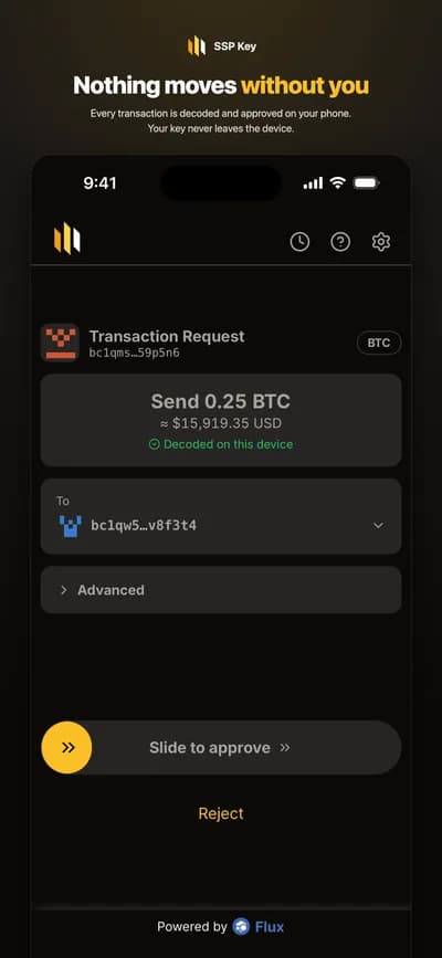
Marketing images with demo balances, ready for articles and listings.


Legal
The SSP name, logos and product names are trademarks of InFlux Technologies Limited. They may only be used as described in these guidelines or with written permission from InFlux Technologies Limited.
You may not use or register the SSP trademarks, or anything confusingly similar to them, as or as part of any trademark, service mark, company name, trade name, username or domain name. Don't use the SSP brand in a way that suggests partnership, sponsorship or endorsement unless one exists, or for anything inconsistent with the SSP Terms of Service. We may revoke permission to use the SSP trademarks at any time, and we may withhold approval of content we consider inconsistent with the SSP brand.
These assets are provided for referencing SSP. They are not licensed as open source.
Questions?
Brand, press and partnership questions: [email protected]